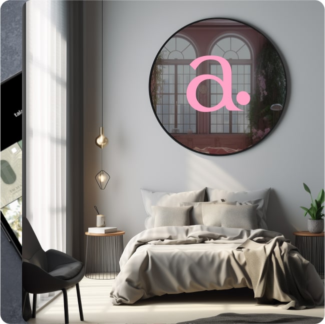
Homewithalicia.
Together with homewithalicia., we got creative to bring their website to life and develop a logo that reflects their vibrant and welcoming personality. Our goal was to create a design that is not only appealing and user-friendly but also conveys the closeness, familiarity, and joyful spirit that distinguish the homewithalicia. brand.
LOGO CREATION
The logo
The logo of homewithalicia. features a stylized "A" in a bold pink color with a dot next to it. The "pink" symbolizes "joy in life" and "creativity," while the "A" represents the name of the founder. The dot adds a playful touch to the logo and highlights the attention to detail that characterizes homewithalicia.

PRINT CAMPAIGN
Design and Strategy for a Strong Brand
Together with the designer, we have developed high-quality print materials to launch an effective campaign and increase brand awareness. This campaign highlights the unique design aesthetic and utilizes a distinctive visual language to capture the attention of our target audience. Through targeted marketing strategies and creative approaches, we strengthen the brand identity and build an emotional connection with our customers. The combination of innovative design and appealing visual elements ensures that our message is conveyed clearly and impressively.
Further References
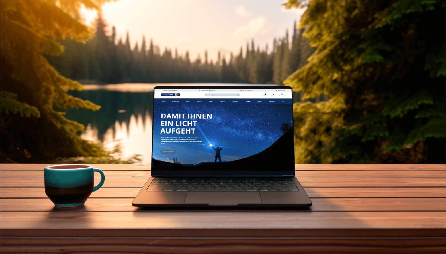
Securtec24
Together with our client Securtec24, we have created a new website that presents the brand in a fresh and modern light.
Read more
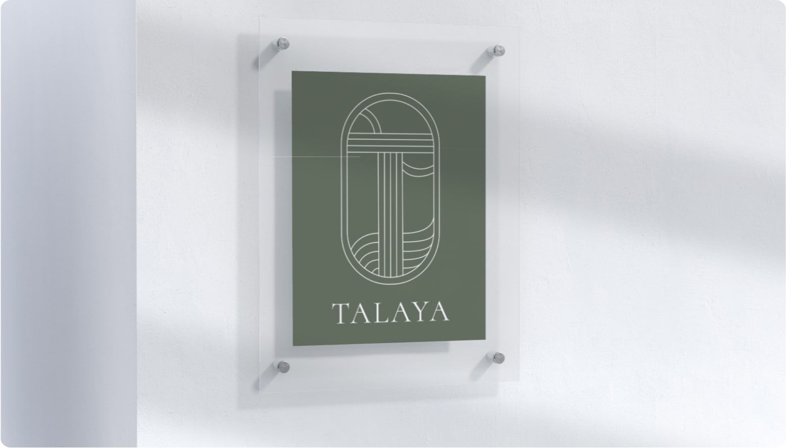
Talaya
Around the world for the logo and branding of Talaya Wellness. Together with the client, we created a holistic and aesthetic brand for Talaya Wellness that combines nature and wellness. The brand is designed to instantly build trust, embody naturalness, and appeal to people seeking a holistic approach.
Read more